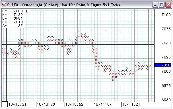
Unlike other charts, point and figure charts have no time axis. Instead of plotting price over time, these charts plot the changes of direction in price on a graph-like grid. The grid shows a column of Xs as the price rises followed by a column of Os as the price falls.

Reversals are constructed according to The Definitive Guide to Point and Figure by Jeremy du Plessis. For instance, notice in the image that columns can contain both X and O. Plessis allows 1-box reversals, helping to make analytics more useful and accurate as well as saving real estate.
Boxes on the grid are exactly 1x1. When you scale the chart, the boxes remain square.
Point and figure charts can help you avoid the noise of minor market movements, as only significant price changes are plotted on the chart.
They also facilitate a quick, visual assessment of the overall trend of the market.
Plotting of price data is dependent on the Box Size parameter and the Reversal parameter.
Box Size establishes a price (or tick) unit by which the system calculates Xs and Os. You decide how many price units make up a box. The price must move this many units in the opposite direction to begin a new column. An X is plotted when prices rise by this size, and an O is plotted when prices fall by this size.
This process of plotting Xs or Os continues until the Reversal is reached. When prices reverse, they must reverse by this amount multiplied by the box size before a new column is plotted. A new column, therefore, signals a change in the price trend.
No Xs or Os are displayed if prices rise or fall by an amount that is less than the box size.
The Data Source parameter specifies the time frame of the data that is used to build the Point and Figure bars. Using longer term data means the display is less detailed but faster to display. Conversely, using shorter term or tick data means the display is more detailed but slower to build.
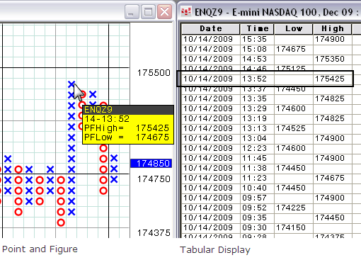
The convention for plotting point and figure charts dictates that each X column start one O above the lowest O in the most recent column, and each O column start one X below the high in the most recent X column. Therefore, there are situations, especially in volatile markets, where the start of each X or O column does not actually represent a price the market traded. CQG alerts you to those situations by highlighting the Xs and Os, which represent actual trades when the vertical cursor is active.
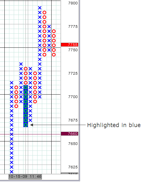
You are also made aware of those situations through the PFHigh and PFLow box where the actual trade prices for each reversal are clearly indicated.
Point and figure charts help establish entry and exit points, determine support and resistance levels, and identify trends and trend reversals.
Price formations are analyzed to expose potential buy and sell signals and breakout from support and resistance levels. Breakouts may indicate where the trend is headed. The longer a price plot moves in the same direction, the stronger the reaction may be on a breakout. An uptrend could indicate that demand has overcome supply, while a downtrend may indicate the opposite.
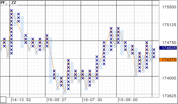
Connect highs and lows using the ZigZag study:
Point and Figure Parameters
|
Parameter |
Description |
|
Color1 |
Color for the Xs. |
|
Color2 |
Color for the Os. |
|
Box Size: |
Specifies the number of price or tick units represented by each X and O. |
|
Box Units |
Specifies whether tick or display price scale units are used for box size. For example, for an EP chart, 25x3 price is the same as 1x3 tick, because on the price scale the minimal price change (1 tick) is equal to change of display price by 25. |
|
Reversal |
Specifies the number of Xs or Os that the market must reverse before the chart shifts to the right and begins plotting the opposite X or O column. Remember that this value is multiplied by the box size. |
|
Data Source |
Allows you to select bars or ticks for the time frame for the data. Choices are 1, 5, 15, 30 or 60 minute; daily; or ticks. The point and figure calculations involving bar data are best illustrated by an example. Suppose the current trend is an uptrend. Initially the system checks the high for each new bar. If the high is high enough that a new box can be filled, we go on to the next bar. In the case where a new box can be filled, the low of the bar is not considered. If the high of the bar is not high enough to fill a new box, we consider the low. If the low is low enough to cause a reversal from the high of the current up-trend, a new down-trend is created. This downtrend is drawn on the chart extending from one box below the high of the up-trend down to the box corresponding to the low of the bar. If the low is not low enough to cause a reversal, no action is taken and the up-trend remains the current trend. |
|
One Step Back |
Tells the system that if the current bar consists of a single box and the market reaches a reversal point, then the next bar is not started. Instead, the current bar continues building in the opposite direction. Only when Reversal = 1. Default = on. |
|
Grid Type |
Select Perfect square or Scalable. If you select Scalable, the grid does not remain in a perfect square pattern when you scale it. |
These parameters can be found in the Formula Toolbox Bar Values:
•PFMid: The Average of the PFHigh & PFLow.
•PFHigh: The high price that triggered the reversal, that is, the top of the highlighted area.
•PFLow: The low price that triggered the reversal, that is, the bottom of the highlighted area.
•PFUp: Reports a 1 if the Point and figure chart is plotting an X and a zero if the point and figure chart is plotting an O.
They can be used in formulas, conditions, custom studies, user values and alerts.
Point and Figure Grid Preferences
Preferences to change the grid appearance are in chart preferences (Setup > Chart Preferences > Grid).
The changes you make to a point and figure chart apply only to point and figure charts.
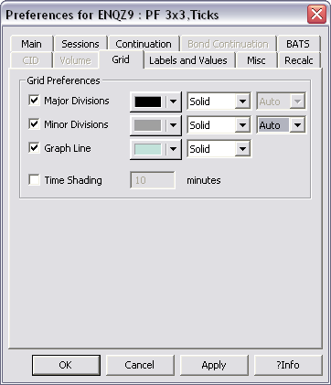
If you select Auto for the division lines, then the system automatically sets the block intervals either at 4 and 8 or 5 and 10 depending on the commodity. For example: CLE intervals are set to 5 and 10 because every tick is a penny. EP intervals are set to 4 and 8 because every tick is .25 index points.
When zoomed in, major divisions occur at either 4 or 5 block intervals.
Point and Figure Tabular Display
It may be helpful to view the point and figure chart as a spreadsheet (tabular display). Data that is displayed graphically on the chart is displayed in a spreadsheet.
You can change views by clicking the button on the toolbar.
•The Long view shows the high and low for each bar in a separate row, so you may have several rows in the spreadsheet that all have the same time.
•The Short view shows the high and low by minute and not by bar, so you will not see several rows that represent the same time. Instead, those prices that occur at the same time are displayed in additional price columns.
•The Bar-Based view displays the PFHigh (high price triggering the reversal), PFLow (low price triggering the reversal), PFMid (average of PFHigh and PFLow), and PFUp (1 = X, 0 = O).