The Net Change Curve chart displays a collection of symbols’ net price change or net percentage change making it easy to relatively compare each market’s current sessions performance. In addition, you can choose to set the net change curve chart to the current time and see the performance from that starting time.
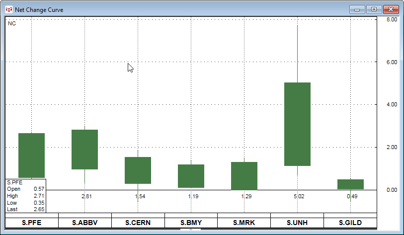
Here is a today’s price net change curve chart of seven US health care stocks.
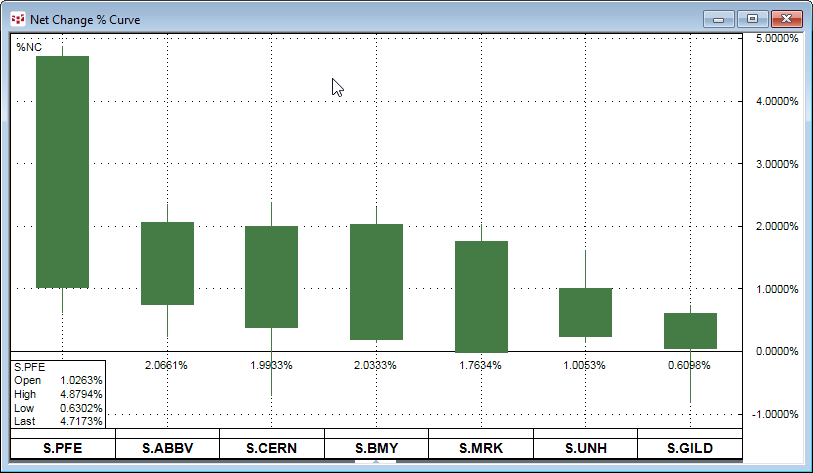
This chart displays today’s percent net change curve chart of the same health care stocks.
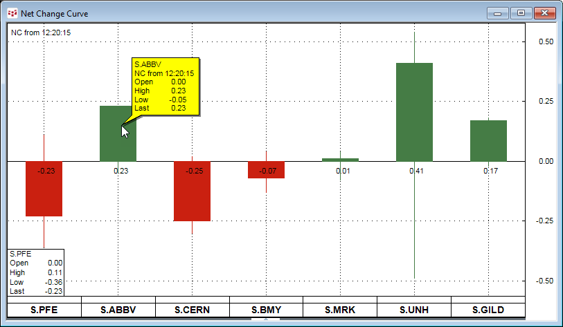
This chart displays the price net change from 12:20:15. The mouse rollover shows the price action from the start time.
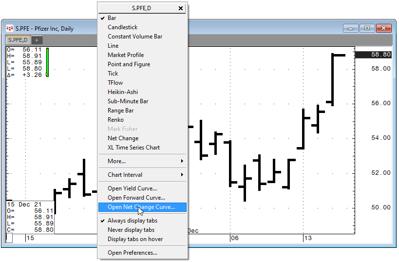
Right-click on any chart title bar to open the Net Change Curve chart.
Net Change Curve Parameters
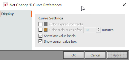
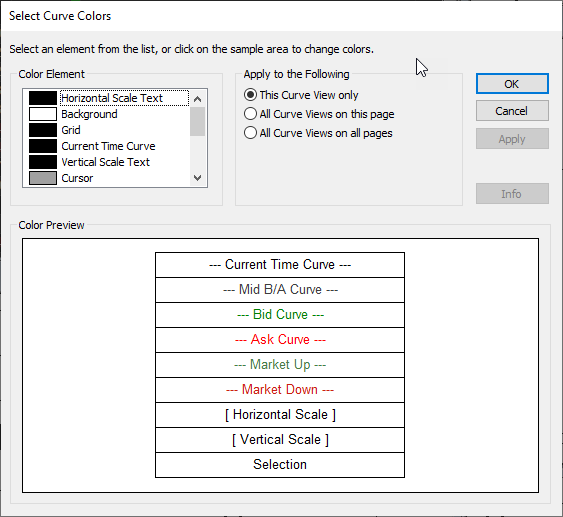
Two sets of parameters are available by right-clicking on the title bar of the Net Change Curve chart.

You can set preferences for color of expired contracts, stale prices, show last value labels and show cursor value box.
Select Curve Colors to set the colors used in the chart.
The Net Change Curve chart toolbar offers the choice of a Line chart or a Candle chart. Click “NC” for the price net change for the session or “%NC” for the percentage net change for the session.
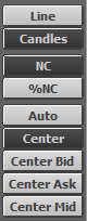
Click “Auto” to set the chart to use the session price net change or session percent net change. Click “Center” to use the current time as the start time for the net change. The time is displayed in the top left hand corner of the chart. “Center Bid” and “Center Ask” sets the current time as the start time for the net change of the best bid or the best ask. “Center Mid” sets the current time as the start time for the net change of the midpoint between the best bid or the best ask.
Right-click on the horizontal symbols along the bottom to open a dialog for managing the symbols and other features.
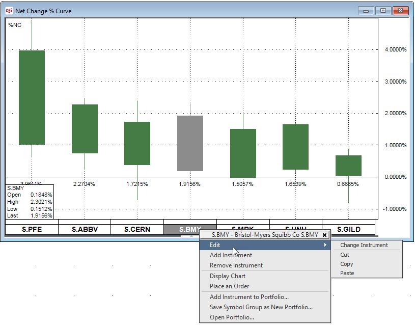
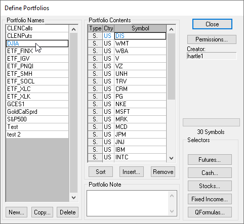
Add a symbol to a current Portfolio or select “Open Portfolio” to pull in symbols from a current portfolio. This example will add the stocks in the Dow Jones Industrial average to the Net Change Curve chart.